When visualizing data, you’re almost always working with color – e.g., with different hues (red, yellow, blue) for categories or color gradients (light blue, medium blue, dark blue) for maps.
If you use them to visualize data, hue palettes and gradients become “color scales.” That’s because they all “map” to some data: For example, every one of your hues stands for a certain category and every color in your gradient stands for a certain value (range).
This article gives you an overview of the different color scales. Let’s start:
1 What to color by
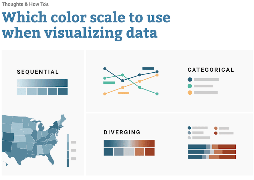
2 Hues: Categorical color scales
3 Color gradients in one direction: Sequential color scales
4 Color gradients in two directions: Diverging color scales
5 Highlighting or de-emphasizing
6 It’s not as clear-cut as it seems
To read further, click here.
You must be logged in in order to leave a comment